Merry Christmas! Keeping up-to-date with the geometric adventures of my friend, Einar Thorsteinn, who lives in Berlin, this is his latest creation: a configuration he defined in 1978 but has just now built. He gave me an explanation about expanding on the transformation in geometry Buckminster Fuller called "Jitterbug" (sometimes when Einar tries to explain things to me it makes my brain hurt), but I just think it’s beautiful—as did Olafur Eliasson, who will be showing a work based on it at a Madrid gallery in January.
Tuesday, December 22, 2009
Greetings from sunny L.A! My trip began auspiciously, with the long-haired, sleepy-eyed student next to me reciting a Shakespeare sonnet (#57) from memory, something about being a slave to love, before nodding off for a flight-long nap. I then downloaded (for free), the complete works of Shakespeare on my iPhone, through an app from playShakespeare.com, which comes with this required caveat:
Rated 12+ for the following: Frequent/Intense Realistic Violence, Infrequent/Mild Profanity or Crude Humor, Infrequent/Mild Sexual Content or Nudity, Infrequent/Mild Mature Suggestive Themes, Frequent/Intense Cartoon or Fantasy Violence, Infrequent/Mild Alcohol, Tobacco, or Drug Use or References and Infrequent/Mild Horror/Fear Themes.
Orozco’s patient remark in their [his paintings’] defense gives me pause: “People forget that I want to disappoint.” That strategy, targeting “the expectations of the one who waits to be amazed,” has worked well for him. I vividly remember being outraged in the proverbial manner of a philistine exposed to modern art when, for his first solo gallery show in New York, in 1994, Orozco displayed, on the walls of the main room at Marian Goodman, nothing but four Dannon yogurt lids. I recovered, by and by, to take the artist’s point, which amounted to disappointment as aesthetic therapy. The transparent, blue-rimmed, date-stamped, price-labelled little items were—and are, at MOMA—rather lovely, when contemplated without prejudice. Are they art? No. They are Dannon yogurt lids. The art part is a triggered awareness that the world teems with vernacular loveliness. If you overlook that, it’s sad for you.
I’m sorry Schjeldahl “recovered” because I haven’t. I’m already capable of seeing “vernacular loveliness” in the world, thank you, and don’t need unsolicited “aesthetic therapy” to remind me that it exists. Orozco aims to “disappoint,” like that would be unusual. Clearly he’s never been to Chelsea.
Have we so lost touch with art’s ability to surprise and delight that we don’t even try anymore? If we were to admit how rare the true art experience is, thousands of museums, galleries, and art schools would have to go out of business.
So we settle for emptiness, cool ideas, and illustrations of theory, and make fun of those who see art as having a higher purpose.
Pinning yogurt lids to a gallery wall is like inviting people to a concert, sitting down at a piano, and then not playing any music. Wait….didn’t someone actually do that? And wasn’t it in, like, 1952?
It’s time we moved on.
Gerhard Richter, Abstract Painting (894-1), 2005 11 3/4 x 17 3/8
If, after the Orozco show, you want to indulge your senses in a retrograde manner, hop on over to the same place we first saw those Dannon lids, the Marian Goodman Gallery, and wallow in Gerhard Richter’s gorgeous scraped abstractions, up through January 9th.
What I wrote below sounded so negative, I wanted to amend it. I don’t want to discount Orozco because, while I find his much of his “conceptual” work tedious, I’m completely inspired by his drawings, small paintings, and collages. It’s just that these are regarded as ephemera rather than the real deal, when I think they are the real deal. Again, this isn’t an argument for painting and drawing over conceptual art, but for Orozco’s painting and drawing over his conceptual art, much of which, for me, falls into a genre Jerry Saltz has written about and Roberta Smith has aptly coined “Curator's Art” (whether or not they’d include Orozco, I don’t know). Asked about the Urs Fischer survey in the comments to the post below, while I find some of his work intriguing, Fischer lost my respect with the hole in the wall that, when you get too close, sticks a tongue out at you. In my book, not only is it just too easy, it sends the same message as Orozco’s shoebox: that museum visitors are idiots and deserve to be treated as such.
To show how undervalued (I'm not talking money here) Orozco’s graphic work is, I can’t even find examples on the Web of the pieces I love best. The overused image above will have to do.
From the Samurai Tree series, IM (2006), egg tempera on red cedar panel with gold leaf, 21 5/8 x 21 5/8"
What is most important is not so much what people see in the gallery or the museum, but what people see after looking at these things, how they confront reality again.
–Gabriel Orozco.
Some artists would be better off wthout retrospectives. Coming across Gabriel Orozco’s work piecemeal in galleries and museums, reading about it in books and art magazines, I was enthralled. Seeing it at MoMA I was dis-enthralled. What looks like a happy eclecticism when viewed sporadically over time reveals itself as dilettantism up close; much that Orozco has done, someone else did better and sooner, so it ends up looking like a lot of threads that were never fully developed--although I, unlike other critics, absolutely adore many of his drawings and collages.
Even where he’s at his best, however, Orozco doesn’t know when to stop and take the work that extra mile—the large paintings that are derived from his collages and drawings look forced. And in the giant gallery in Prints and Drawings on the second floor, Orozco chose to mount an around-the-walls repetition similar to Andy Warhol’s Shadows (1978) but without the sublimity.
Recycled works such as the installation of four clear yogurt caps pinned to opposing walls and the empty shoebox at the entrance to the exhibition seem, especially the second time around, less like conceptual art than sheer hubris, what the artist can get away with because of his celebrity. My friend Ann has coined the phrase “poke in the eye art” in that it makes fun of the rest of us who are struggling to create something meaningful. Also I resent the idea that the masses out there, your average museum goers, are unseeing, unfeeling ignoramuses who need artists, superior beings that we are, to lead them out of the darkness—this time by upsetting their expectation to see something satisfying when they shell out $20 to go to a museum.
Don’t get me wrong, this is not an argument for craft for the sake of craft. I’m all for art that calls for a minimum of intervention (such as when, in 1975, Robert Irwin transformed the space in a gallery at Chicago's MCA with just a strip of black tape or Orozco, in 1993, placed an orange in each of the windows of the buildings adjacent to MoMA--brilliant!). But when the message is oblique, didactic, and separated from its intention by the distance in time....sometimes a shoebox is just a shoebox.
Also check out Deborah Sontag’s review in Friday’s Times and Holland Cotter's review today (12/14/09).
Monday, December 7, 2009
This from my hike yesterday on the mountain. Otherwise tweaking my Anne Truitt piece (scheduled for the January Art in America), working on the Person of the Year cover (not my artwork, someone else's), making travel plans for Christmas in California, and going back to the city today for Orozco at MoMA and Sting at St. John the Divine. Will be back on track soon....
Last night, after the turkey, we watched two films from 1963-64 back-to-back: Brigitte Bardot in Jean Luc Godard’s “Contempt,” and “Viva Las Vegas” with Elvis and Ann-Margret. To my male friends it was high camp, but for me, watching them produced flashbacks of what it was like to grow up in that era: wanting men, wanting them to like you, wanting them to want you, but at the same time having to fend them off on a daily basis, the frustration of having your strengths ignored while being valued for your sexual potential: no one was ever going to understand the damaged woman Bardot played so beautifully in “Contempt”—except, of course, Godard, who somehow managed to see it all, which makes it an oblique but powerful film.
Ann-Margret, then Ann-Margret Olson, was a few years ahead of me at New Trier High School in the Chicago suburbs. One of 3,000 over-achievers in a public school that boasted a fully professional theater facility and a faculty sprinkled with Ph.Ds, Ann-Margret was already an icon—a cheerleader and the star of everything. She was dark-haired and beautiful, with a singing voice that could handle any style. I remember a prom where she sang a jazz song a cappella, holding a room filled with probably 1,000 teenagers rapt. But even though her version of “Heat Wave” in the student variety show was so hot my friend Donna’s parents walked out, it wasn’t her sexiness that stood out—she wasn't provocative at all—but her strength and determination. She didn’t go out with the high school boys; my ex-husband, who was in a band with her briefly, said that it was because she knew she was destined for greater things. Flash forward a couple of years and I’m on vacation somewhere with my parents, watching (I think) the George Burns Show, and there’s Ann-Margret, completely transformed. Her straight, glossy dark hair is now frizzled and red-blond, she’s speaking and singing in an unfamiliar little baby voice and, like her character in “Viva Las Vegas,” acting all weird and coy. I didn’t understand it at the time, but looking back it was one of those coming-of-age moments as I wondered, why would she hide her talents and do this to herself? Why would she allow this to be done to her?
A former colleague from Bennington tells me that the current crop of female students wants to disassociate from feminism, clearly not understanding the emotions that prompted it. They don’t want to be angry—perhaps they want to be liked? If so, we’re all in trouble. While it might appear that we’ve gone overboard with the whole sexual harassment thing, talking with my dinner companions last night I recalled what it was like to be female before the culture had those constraints—the high school and college teachers who hit on me and then gave me bad grades, the (two) dentists who would rub themselves against me as they drilled (think of how conveniently the dental chair is situated), doctors who took advantage (how to explain my first gynecological exam to my mother? I didn’t), the Purchasing Agent at Evanston Hospital, who literally chased me, the temp, around his desk. Then there was my only corporate job—at Whitney Communications, which owned Art in America in the mid-to-late 70s—where, among other things, the vice president used to routinely feel my back to see if I was wearing a bra and snap it if I was. That was our world; we took it for granted. Once we discovered we had rights, that we didn’t have to put up with this shit, yes, we were angry. What I love about “Mad Men” (check out this clip) is that it’s not an exaggeration.
Too much of the discussion around feminism is centered on the political action, rather than the culture that provoked it, choking off any serious analysis of where we stand now. I’d love to teach a class focused on the culture of the times, and I’d start with “Contempt” and “Viva Las Vegas.”
Contempt:
Viva Las Vegas:
Wednesday, November 25, 2009
While I’m waiting for my friend Richard to call so I can post the best Facebook story ever, can we talk about apps? I’m always wary of writing about this stuff because I figure half of everybody already knows it all, and those who don’t, don’t care. I won’t bore you with the long story of how music technology challenged I’ve been for three years since moving into this house, but the short story is that I had it totally wired for sound at great expense—by a very sweet guy, a coke-head who up and split town leaving a bunch of tangled wires in his wake—and no matter how many experts I’ve employed, I have not been able to get streaming radio to work properly. And as far as I’m concerned, life without streaming radio is not worth living. Well that may or may not have been fixed today, but before my latest tech guru came over, I was leafing through New York magazine at breakfast, and learned that I could circumvent my computer with a free Pandora app for my iPhone. I instantly downloaded it, plugged it into my stereo, and viola! endless wonderful music. My only complaint, and it is small, is that having ascertained my alt rock bent (Radiohead, Pixies, Silversun Pickups) it plays an excess of Death Cab for Cutie (which I don’t really mind, but enough is enough) however I’m confident that with adequate training, it will get over it. Whew!
So I’ve been happily dancing and singing along in the kitchen tonight, preparing my wild rice contribution to my friends’ annual pot luck, and hope everyone has a thankful Thanksgiving.
Oh my, it’s a rather gloomy time for Art Vent. Today I was saddened to read that Jeanne-Claude died, and I’m sad for Christo; I’ve never known a couple more intertwined. It seems significant to me, and was significant for them, that they were born on the same day, same year. They met through Jeanne-Claude’s mother, for whom Christo was a kind of art project. She commissioned him to paint her portrait and even live in their Paris home for a time, never dreaming that this poor Bulgarian immigrant and her debutante daughter—meant for better things—would take up with each other. They were my neighbors in SoHo, but I really got to know them when we worked together on a cover for TIME’s Planet of the Year, 1989. Ever after we greeted each other as friends; they came to my opening at Gary Snyder in 2002, and invited me to the openings of all their events. Below is an excerpt from a paper I gave on the occasion of The Gates at a symposium presented by the International Association of Art Critics (AICA) at the Guggenheim. Sadly the postcard, which was tacked to the bulletin board in my former loft in SoHo—the only one I ever got with such an ego-gratifying message—fell through a crack behind the built-in desk, never to be seen again.
My first contact with Christo and Jeanne-Claude was In 1989 when, as fine art consultant to TIME Magazine, I proposed commissioning Christo to do the cover of a special issue about the state of the environment: “The Planet of the Year: The Endangered Earth.”
But when I met with them, Christo said, “The idea is banal.”
Jeanne-Claude said, “Christo doesn’t do commissions.”
My deadline was the next Wednesday. “If you change your mind,” I told them, “you can call me at home any time.”
Jeanne-Claude called me at 7:00 Tuesday night. “Christo has an idea.”
The next morning, the art director, Rudy Hoglund, and I went to the studio, where Christo presented his plan to wrap a globe of the earth in semi-transparent plastic, tie it with twine, and photograph it on the sand at Jones Beach with the sun rising behind it. It was the perfect image: the earth bound and enshrouded in a claustrophobic film, with the sunrise a sign of optimism.
Leaving the studio we were walking on air, until Rudy asked me what I’d negotiated about the copyright.
Copyright? It was my first commission for TIME, and I had to admit I hadn’t considered it.
Hearing this, Rudy's face turned bright red and he started stomping up Broadway.
I spent the next weekend on the phone between Jeanne-Claude and TIME’s lawyer, working out the details of a contract that became TIME’s standard agreement with fine artists. In the process I learned a lot about copyright and also about the way Christo and Jeanne-Claude work. I learned about their openness to possibility. Their decision to refuse all commissions was one that served them, but it didn’t blind them to the one situation that might be different.
I was impressed by their willingness to negotiate a solution that would maintain their integrity in the project without impeding it. It was a remarkable exercise in both flexibility and inflexibility that comes, not from ego, but from recognition of what’s really important.
After it was over, I received a post card that read simply “You were right,” signed: Christo and Jeanne-Claude.
So although the TIME Magazine cover was their smallest public project, it was also the one that reached the most people. And according to newsstand sales, one of the most popular TIME ever ran.
Their work illustrates that even with a minimalist, non-representational approach, high art need not be elite, that artistic rigor and public engagement can indeed go hand in hand. There’s a distinction to be made between work that seeks to be popular by pandering to existing perceptions of what art is, and art that transcends those expectations to create an event that becomes a vehicle for social and esthetic advancement.
Why no posts? Because I have no thoughts, no opinions. I am a blob. My mind is a vast wasteland, everything Truitted (see below) out of me. I did make my deadline, though, despite nearly going berserk at the end trying to identify quotes for footnotes (no, I didn’t write them all down, I know, I know), spending last weekend thumbing endlessly through three volumes of index-less memoirs. I’m trying to get up to speed in the studio, doing some work for TIME, but otherwise just want to sit and knit in front of the films about bands Netflix has kindly sent me. The last couple of weeks were intense, travel-write-travel-write, and in the middle Jon Gams, the publisher I worked with at Hard Press Editions, died, leaving a great gap in the art book business. His dedication and vision were rare. Jon was the one who published Mike Glier’s Along a Long Line, which I had a hand in, and also Jerry Saltz’s Seeing Out Louder. I know he was thrilled at the turnout for Jerry’s book launch, the last time I saw him, so he went out on a high.
Actually the comments to the post before last, have turned out to be more interesting than the post itself. There appear to be those who think I’m “overreacting” – a term that has been applied to feminists since the beginning of feminism. Sexism, however, is not dead, as many would like to think, and until it is (assuming that happens in my lifetime) I will continue to make essential distinctions. The catalogue essay for the Truitt exhibition is only the tip of the iceberg, but takes priority as it was officially sanctioned by the museum, and will stand to represent Truitt for years to come. The more ephemeral writing, however, was even more blatant. Along with the Charlie Finch diatribe for Artnet I previously cited, there was Blake Gopnik’s rant in the Washington Post, which counts as the most scathing and sexist writing I’ve ever encountered about an artist, seconded only by Mario Naves when he wrote about Nevelson. Not to speak of Post staff writer Mark Berman‘s appalling article about Truitt entitled “A Dutiful Wife Who Sculpted Her Own Identity” (hard to believe in 2009, but there it is). Even now I’m wondering what it is about Truitt of all artists, that raises the male hackles and causes even women to deal with her on sexist terms.
I’m reminded of an incident that happened 15 years ago (I hope I’m not repeating myself here), when I wrote an article for Art & Antiques about my great-grandmother, an artist and early chiropractor. When it came to the contributor’s blurb, which I insisted on vetting, the twenty-something female editorial assistant had written something like “Diehl has recently gotten a grant to do some paintings of her own. Will they be in the style of her great-grandmother?” I made the magazine pull it, saying that I wouldn’t let the piece run otherwise. That night I was at a dinner with Louise Bourgeois, with whom I was working on another article, and told her what happened. She started pounding the table saying, “It’s not about promoting our art, we must defend it. We must defend our art!” So that’s what I’m doing, for all of us.
Friday, November 6, 2009
I’m too deep into Truitt to write a proper post, but as an addendum to the one below, will note that last night I attended Roberta Smith’s lecture at the New School, sponsored by the International Association of Art Critics (AICA), where she talked about writing description as a way of coming to an understanding about an artwork. She also wrote a review in the Times today of the Roni Horn exhibition at the Whitney that includes a digression on the subject of “curator’s art”:
Ms. Horn’s work has both benefited and suffered from being what might be called “curators’ art.” Curators’ art is indisputably, even innocuously, elegant — with clear roots in Minimal and Conceptual Art and not much else. It tends to be profusely appreciated by a hermetic few, curators, artists and theorists, who fetishize its refinements and often take its creators pretty much at their word. Ms. Horn has always had a lot to say about what her work means and how it is to be viewed, and some of it is quite interesting, but artists don’t own the meaning of their artworks.
Doing research on Anne Truitt (1921-2004) and her current Hirshhorn Museum survey, I’m reading the catalogue essay where curator Kristen Hileman writes:
Not wanting to anchor the work in a linear narrative, or imply that her sculpture in any way ‘illustrated’ a particular event, Truitt herself was reticent to make fully explicit the connections she nevertheless acknowledged between her life and art. Instead she emphasized the importance of the transformation from the specific to the universal in her process.
After stating clearly what the artist would not have wanted, Hileman turns around to do exactly that:
The elucidation of some of the events, places, people, literary references, and philosophies that appear to constitute fragments of the iconography Truitt perceived behind her ultimately irreducible works, however, provides another lens through which to consider Truitt’s unique and highly expressive deployment of the objective language of color and geometry.
Hileman then, throughout the essay, continues to interpret Truitt's work through biography as in:
The two works further appear to convey a sense of the “powerful” and “looming” qualities the artist associated with Asheville’s mountains….” and “Truitt’s childhood encounters in and around fences lend a psychological dimension to the boundary depicted in First…
Inanimate sculptures that do not include a video monitor and on which nothing is written cannot “convey” or “appear to convey” anything, and any “psychological dimension” that can be associated with an art work is elicited by the configuration of the work itself, not by specific pre-knowledge of the artist’s history.
Granted Truitt, having published her memoirs in three volumes, invites this sort of exercise more than most, however the dependence of critics and curators on information that is not intrinsic to the work is epidemic—and, because the backstory is so often used to justify or rationalize what's on view, I will even go so far as to say that it’s responsible in large part for the ridiculous amount of bad art we see out there (an artist friend wanted to blame it on the artists, but they’re not the ones making the selections, and further, this kind of thing only encourages them to think that’s what art is).
Interpreters of art seem unable to deal with the object itself and instead rely on externals, often having to do with the artist’s “intention” or political bent or, when dealing with artists like Luc Tuymans or Josh Smith, how their work represents some kind of reaction to the history of painting. But it’s really simple. The work is the work, no matter who did it, when s/he did it, or why s/he did it. Biographical information, such as the fact that Richard Serra had day jobs in steel mills is worth noting if trying to determine how he arrived at his format, but the work itself, that big thing made of metal, is something else entirely. What does it convey or express? Nothing. What are its “psychological dimensions?” None.
While it seems that the function of curators and critics should be to open up the discourse to many interpretive possibilities, this conflation of intent and biography with the work allows for a single reading, too narrow a lens through which to view any artist, especially one as evocative as Truitt.
While in Washington on Friday to see the exhibition and catch James Meyer’s excellent gallery talk (Meyer being the perfect example of an art historian who knows what’s important and what isn’t), I also had lunch with Tyler Green of Modern Art Notes, who said he thought that with the advent of photography, writers about art were not so inclined to engage in elaborate description.
If so, this could explain a lot, because for me, it’s through being forced to describe something that I learn what it is and what I really think about it. In fact this is why I write about art at all, because I wouldn’t engage in such a detailed exercise on my own. It’s how I learn, and it’s how I teach students to write about art. In fact I think everyone studying any aspect of the arts should be required to take art writing, not so they can better write their theses or that noxious item we call the artist’s statement, but because through writing description you learn to observe what’s outside—and inside—you. And no matter what the endeavor—be it art, bricklaying, dentistry or cooking—observation is everything.
Well God really is on Facebook (see Hiatus below). Before leaving for California, I wrote this Status Update:
“Carol Diehl is flying to SF in the early morning, off to Big Sur for son Matt & Michelle's wedding. Sun predicted for the Friday nuptials (yeah!), tomorrow heavy rain and high winds—just the thing for driving down Highway 1.”
….and got this message:
"hi carol, it’s your old neighbor from greene st! i now have a ranch about an hour south of sf right off of hwy 1. the winds and rain are supposed to be formidable (60-80mph sustained!!!). here’s my number if you need a pit stop. you might and it would be great to see you. best jane"
So when I found myself in San Francisco following a white knuckle flight (after circling for an hour in zero visibility, the pilot announced that he’d “never been so happy to land”) looking out the airport windows at trees bent in half by the wind and wondering what to do, I called Jane Rosen, who I never knew that well and hadn’t seen in (fifteen? twenty?) years, who told me the road was washed out from San Francisco to Half Moon Bay and that I should sit tight. A good thing because when I called the Ripplewood Resort, where I was to have stayed that night, the woman at the desk made out like I was being a wimp (“there are other roads to get here…”) and then next day when I did arrive I saw that a giant redwood had come down across the river not 50 feet from my cabin.
I got the last available room in an absolutely lovely airport Marriott with a balcony looking out on trees and the smell of eucalyptus in the air (“Toto, we’re not at JFK anymore”), and the next day on the way to Big Sur stopped off at Jane’s. “I want you to see what a loft on Greene Street will buy in California,” she’d said, her words echoing my mind as I navigated the steep dirt road to the house at the top of the mountain with vistas all around, where Neil Young is her nearest neighbor.
“My lover is a place not a person,” Jane says, “I’ve never loved a man as much as I love this property—I’m romantically involved with it, I hate being away from it, and I want everybody to meet it.”
On Thanksgiving vacation in 1989, while visiting her brother, a physician at Stanford, they were driving the gorgeous stretch of Highway 1 below San Francisco when, she told me, “we got to this road and there was a moment of recognition. I said ‘I want to live here' and my brother said, ‘Don’t be silly, Jane, no one lives here. Cows live here.’ But I was clear, more than I’d ever been in my life.” After renting nearby and going back and forth to New York, there was the miracle of the property not being officially for sale but owned by a woman who knew her work….and when, in 2001, she sold her loft (which she bought, raw, in 1969 for $10,000 when hardly anyone lived in SoHo) her friends celebrated, she says, because they couldn’t stand to listen to her talk about her ambivalence any longer. By 2005, she was living out her "Jewish cowgirl" fantasies full time.
Giving up the loft, the art world, her friends—all New York meant—to live on a mountaintop with her dogs (and now horses, although she doesn’t ride) took a tremendous leap of faith. In so many ways Jane was convinced she’d committed career suicide. But her sculpture, always nature-based, took on new life in the fresh air, and through many connections to regional galleries, her career is thriving. “I didn’t want to be Queen of the Art World,” she says, “I wanted to be Morris Graves and make work until the day I died. I wanted to show people the story in nature so they wouldn’t fuck it up anymore, so found other ways to do business and make the best work I can.”
Recycled Provencale limestone, discarded cut-offs from stone used for building, waiting to turn into sculpture
In that she is enthusiastically assisted by Alex Rohrig and former student Sebastian Ages, who made us a wonderful lunch of fresh, local produce—after which, eager to get back to work, Jane sent me on my way.
Jane with Alex and Sebastian
While the top of the mountain was sunny, the beach at the bottom was still gray from the storm.
The wedding under the Big Sur redwoods was vivid and mythical (son Matt’s words), a true love fest—made even more so by the presence of Zach, Nick, Nora and Maisie, ages 3,4, 6 and 8, the children of both Michelle’s best friend and Matt’s step-sister. Today, reading “For Some Parents Shouting is the New Spanking” ("most emailed" in the Times), I thought about how happy and expressed everyone was, how the children intermingled with the adults for the entire weekend without incident—no tears, no drama—their presence adding significantly to the joyous vibe. I’ve observed that parents who yell and feel guilty about it tend to be those who are most afraid to assert themselves, letting bad behavior go until they can’t stand it anymore—like my friend who, instead of nipping it in the bud, used to tolerate her daughter’s endless whining before exploding (and 15 years later she still whines). The hallmark of such parents is the anxious “Okay?” they attach to every directive, as if begging permission from their children to set the terms. I can’t claim I never lost it as a parent, but I found that being clear and tenacious enabled me to truly enjoy my children (looking back, although my life has always had richness and depth, the time when my sons were small was the happiest of all—as well as the most artistically productive). The parents of the children at the wedding had done their work beforehand so could trust them to roam free and have a good time. Hardly repressed, here’s little Zach on the dance floor:
I'm off to California for son Matt's wedding in Big Sur, will post again in a couple of weeks. In the meantime, I thought you'd like to know that God is on Facebook:
Vik Muniz, Self-Portrait (I Am Too Sad To Tell You after Bas Jan Ader) (Rebus) 2003
If I had my own art magazine, I’d never publish just one review of anything, but gather a number of opinions. Many moons ago, when I worked at Artforum, we published six artists’ takes on (I think it was) a major Matisse exhibition, and it told me so much more than just about Matisse. Last week Mike Glier, Roberto Juarez and I, all painters, went to hear Vik Muniz lecture on his work at Williams College, and the result was an impassioned email exchange. For those not familiar with Muniz’s work, he generally arranges unusual media (sugar, poured chocolate, color chips, thread, wire, garbage) to form an image that he then photographs. Most often these images are already famous in the culture—say, two views of the Mona Lisa, one from peanut butter, the other with jelly, or the famous Hans Namuth photograph of Jackson Pollock rendered in dripping chocolate, or Titian’s “Icarus” made from junk.
Mike Glier:
When Muniz spoke at Williams, he was warm and articulate and his work was ambitious, but I was annoyed by the talk. In fact I was so bothered after this charming talk, I had to pause to think about the sources of the feeling.
On a pan of snow a student, Patrick Hubenthal, drew the Sphinx in ink. It was around 1990 at Williams College and the class, guided by a reading from Roland Barthes’ “Mythologies”, had just completed a discussion of the semiotics of materials. Patrick brought the pan of snow in from the cold, and as we critiqued the Sphinx it disappeared. Patrick also drew a man tenderly bottle feeding a calf, using beef gravy as his medium. Years later, in response to the same assignment another student injected bubble wrap with colored water to make a pixilated version of a Madonna which shown like stained glass when hung in the light. Yet another used her blood to draw a portrait of her mother.
After the Muniz lecture I was irritated that an important career like his has been crafted from an idea that I think of as an introductory design problem. Like the students inspired by Barthes years ago, Muniz showed multiple examples of drawings made from unusual materials like thread and food and garbage. But I don't complain when someone makes art from something as clichéd as charcoal, so perhaps it's best to consider the final product of Muniz rather then the originality of his materials.
But I was also annoyed that student works like those I described above, which were equally interesting to Muniz, are gone and appreciated by so few. But beauty disappears everyday, and often goes unappreciated. In retrospect annoyance wasn't what I was feeling after the lecture; it was a cover for grief, just a little grief over what is saved and what is lost.
With these feelings put to the side, it's easier to look at his body of work and consider individual works, many of which are very good. The "Memory Drawings" are really terrific examples of the power of photography to create collective memory. I also liked the "Sugar" drawings which tied the sweetness of children to the harshness of the lives of their parents who worked in sugar cane production. After these two pieces, I thought much of the work simply clever. But in a few works the symbolic nature of the material/s reacted with the image to make something resonant. The portrait of Sigmund Freud drawn in chocolate, for example, was a winner not only for the masterful splashing gestures, but also for the sensuality of chocolate and its potential as a vehicle for compulsion and its reference to all things anal. But Pollock in dripping chocolate was silly and an example of conceptual art reduced to a visual one-liner. I also liked the colossal copy of Caravaggio’s “Narcissus” traced in a huge scale with junk. This time he brought an image forward from art history but tied it neatly and poignantly to the ennui of modern consumer society. The portraits of Divas derived from the work of other photographers and drawn in diamonds are trashy-stylish, but I just don't find any sustenance in images of fabulous excess. And didn't Andy Warhol do the same thing in the “Diamond Dust” series? Vik Muniz, Sigmund Freud (From Pictures of Chocolate), Cibachrome, 1997.
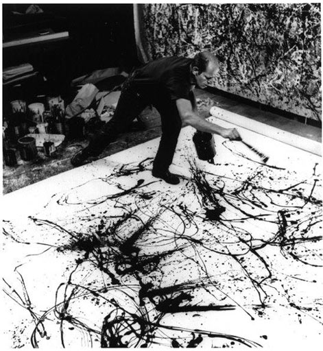
Vik Muniz, Pollock (from Pictures of Chocolate) During the Muniz lecture, I kept thinking about Richard Prince and the Pandora's box he opened when he presented other people's photographs as his own. Or his joke paintings in which the joke written on the canvas, becomes more pathetic as its content becomes depleted by endless readings. These works had a deep sadness to them, as if there was nothing left to do or say, but only repeat, repeat, repeat what is already known. Muniz also borrows from artists and photographers with abandon, but without any irony or particular feeling. Quoting great art makes his work seem "cultured' and it provides a great composition at no cost. But too often Muniz does not find the chemistry between material and image that transforms the both of them into a new work of art and as a result many of his works are only copies of the art of others made in unusual materials.
Roberto Juarez
I appreciate the thoughtful laying out of Mike’s annoyance with the Muniz lecture. I see the point about originality. But when I think about Muniz I’m thinking about photography and how it is used in ways that are different from painting and design. That’s where Andrea Serrano and his submerged crucifix in urine comes to mind. What we are looking at there is a photograph that triggers a response, which is what Muniz also does in a different way. His renderings of existing art in different media create responses that can be sensual, funny and also tender, all things I look for in art, even photos.
Also Muniz is from Brazil .where survival and joy of life live in the same house, and that sensibility comes through.
There’s a state, when you’re making a painting where you capture a certain liveliness of color and form, yet when you try to take a picture of it, you find it doesn’t translate to photography. You can’t get it. Muniz is able to capture those moments in a way that’s sensual and immediate, that photography doesn’t usually do—not well, anyway.
He has come upon a design-y way to make that media sing and laugh again. Yes, it is gimmicky, but it works. I look at his picture of Freud in chocolate and it’s ridiculous on the one hand, but it sucks me in in a way that goes deeper than just how it’s made. I think his Divas were trashy but that's what I want in a diva. (By the way I think the source for those pictures, were the credits for one of my favorite films as a child in Chicago, "Imitation of Life." )
Vik Muniz
I saw one of those diamond diva pictures the day before, at the Phillips de Pury auction house, and it was spectacular. First of all it was big and beautiful and the detail wasn’t tasteful like Andy, but glitzy and tawdry, more like a drag queen. Also Muniz was very strategic about the number of prints he made (three). So in one way he’s saying that photography isn’t precious, but then he makes it precious again, like knocking something off the pedestal and then putting it right back on.
Carol Diehl:
While I appreciate what Roberto is saying, I have to agree with Mike on the point of originality. During the lecture I was totally captivated, but once I left—unlike a great concert where you keep replaying it in your mind with pleasure—the memory of it felt empty. Muniz is delightful and intelligent, his ideas are clever and the pictures are beautiful—but is it our goal to have clever ideas and make pretty pictures? Or is it to present something that provokes a deep emotional response?
What is it we’re always telling our writing students? “Show, don’t tell.” Well it’s true for visual art as well. The best art suggests rather than tells, creates mystery, doesn’t give away the entire story but provides places for our minds to wander in new ways. A truly great work of art bears repeated viewings; every time we look at it we find more to see, experience it differently. When we’re confronted with art-about-art such as Muniz’s, because it’s a treatment of an image we already know, we swallow it whole. There’s no tension because the end of the story was given away in the first paragraph.
I’m an advocate for original imagery not because of any particular art world snobbism or belief in its preciousness, but because the quest for an image that speaks for an artist is supremely difficult and challenging, and that struggle with success and failure ultimately becomes evident in the work, making for a deeper, more satisfying experience for the viewer.
Vik Muniz, Pictures of Color
Gerhard Richter: Betty. 1988. Oil on canvas, 101.9 x 59.4 cm. The Saint. Louis Art Museum. Copyright Gerhard Richter. Photo courtesy Saint. Louis Art Museum.
This may seem incongruous coming from an artist who uses found imagery in her own paintings, and who has professed her admiration for Shepard Fairey and Olafur Eliasson: one who takes a certain pride in his lack of technical ability, who samples the work of others to create his images, and the other who works with a team on his ideas. Yet to me this is not at all contradictory—these are simply methods, different avenues taken to arrive at unique statements that engage on a wordless emotional level.
Apparently it's decided and Rio de Janeiro is going to be the host city for the 2016 Olympic Games. My Brazilian friend, Helga, sent me this promotional video and after watching it, I'm not surprised.
Last Friday night was the first installment of this season’s monthly Review Panel at the National Academy Museum, a series that consistently ranks among the few not-boring art panels in the history of the Universe. This time, as usual, moderator David Cohen stirred the pot, while panelists David Carrier, David Brody, and the razor-sharp Linda Nochlin (whose feminism, with her insistence on the word “germinal” rather than “seminal,” has not flagged) weighed in on four current gallery exhibitions: Maya Lin, Chris Ofili, Kehinde Wiley, and Janine Antoni.
Kehinde Wiley, After John Raphael Smith's A Bacchante after Sir Joshua Reynolds, 2009, Photograph, 31 5/8 x 39"
The last two contained examples of “art about art”: Most of Kehinde Wiley’s photographs are examples of young Black hip-hop guys in the same pose as famous women from art history (odd that no one mentioned Robert Colescott here), and Janine Antoni’s refers to, among other things, Louise Bourgeois’s multiplicitous spiders.
Janine Antoni, Inhabit, 2008, Digital C-print, 116 ½ x 72”.
You know my stance on wall text (so can imagine my reaction when David Carrier said he didn’t fully grasp the Wiley paintings without the labels) but have I ranted sufficiently about how utterly lame I think most “art about art” is? Especially when it devolves, like the Antoni piece, into a game of “Find That Reference.”
I want to see art that’s powerful enough to keep me in the experience all on its own, not as a comment on something else, and not something that I have to bring extraneous information to—such as the “artist’s intention”—in order to “get” it.
Or, to put it another way, reference to other art, or anything outside the work itself, triggers an intellectual response that can get in the way of an emotional one. It offers only one interpretation, which makes for a closed circuit, rather than serving as a stimulus to the viewer’s imagination and opening it up to myriad possibilities.
“Art about art” is a lose/lose situation: if artists are better than those they reference, the citation only drags them to a lower level—and if they’re not as good (somewhere I think I used the example of David Salle’s paintings after Chardin) then all the viewer can think about (after “Oh yeah, Chardin”) is how they’d rather be looking at the original..
Uh, except maybe in this case…
Kehinde Wiley, After Jean-Bernard Restout's Sleep, 2009, Photograph, 30 5/8 x 49 1/8"
As I’ve boasted elsewhere on this blog, that despite being a certain age, I have nearly perfect vision, distant and near, and don’t require glasses even to read a telephone book (not that anyone uses them anymore). But I noticed changes in my focusing ability in the last couple of years, so took myself to a behavioral optometrist in Northampton who pronounced my eyes healthy and my vision good except for a “convergence problem.” When I told her I didn’t believe in glasses she said was not against them entirely and there were situations where they could be helpful, but mine was not one of them and in fact glasses would make the condition worse.
The upshot was that I had an hour-long test on Thursday and, in addition to doing 15-20 minutes of daily exercises on my own, for the next six months will be driving to Northampton once a week for vision therapy. What’s interesting about the test was that it didn’t seem to have as much to do with the eyes as the brain. It was all about perception (“look at this image and tell me which of the images below matches it”) and visual memory (“look at this image for 5 seconds and after I take it away tell me which one it matches”) and reading comprehension.
The last reading comprehension test I took was in high school, where I excelled at being an “under-achiever” in the parlance of the day. In an effort to get at the root of the problem (nobody figured out that I just wasn’t interested) I was given a reading comprehension test on which I scored 100%, but because they didn’t know what else to do with me I was put in remedial reading class anyway—after which (surprise!) I again scored 100%.
This time my score was 80% and when I was taking this and the other tests (which I would have assumed, being an artist, I’d be better at than most—and might be for all I know; Michelle, the therapist was supremely noncommittal) I could almost feel parts of my brain being grouchily awakened, as if from deep sleep. It was actually uncomfortable, not fun at all, and in order to prepare for the hour-plus drive back I took a therapeutic walk—to the candy store for a dark chocolate pecan turtle.
My chiropractor is enthusiastic, saying that the therapy will forge new brain pathways and even cause me to use my body better—“It’s all related,” he says. Even so, I’m not sure I’d make this commitment were I not an artist, and if I hadn’t recently been reading about the brain and the importance of exposing it to non-habitual activity.
To that end I’ve also resolved to use the hour each way in the car to study French. I originally learned it as an adult (for three years at The New School with Huguette Martel, an inspired teacher of subtle humor who has also done cartoons for The New Yorker) and was appalled to find, on my last trip to Paris, that only the nouns were left.
However for me to stay interested there has to be an aesthetic component—I can’t imagine anything more tedious than driving back and forth to Northampton repeating phrases like "Où se trouvent les toilettes s'il vous plaît ?" –so I’ve decided to memorize French poems from podcasts by a woman named Camille Chevalier, who makes even the depressing and pedantic 19th century poem El Desdichado by Gérard de Nerval sound musical and uplifting. After a few trips I may not be able to locate the bathroom but I’ll be smarter and able to explain to anyone who asks that “Ma seule étoile est morte, et mon luth constellé porte le soleil noir de la Mélancolie” (My only star is dead, and my starry lute bears the black sun of melancholy).
Somehow, even with my New York Times “Alerts,” I missed Roberta Smith’s article (Sept. 13) “Artists Without Mortarboards.” I did, however, catch this letter in yesterday’s Times from Jeff Abell, associate chairman of the interdisciplinary arts department of Columbia College in Chicago, where, as visiting artist, I taught for a term in 2004:
Ms. Smith’s article has made the already tenuous tenure of artists in academia even more tenuous. Her call for artists to go forth without credentials is naïve at best and seems to assume that graduate programs fail to teach artists survival skills or encourage them to develop emotionally vivid works.
I concur with Ms. Smith that the Ph.D. in art is a bad idea in the United States, where an M.F.A. entails 60 hours of graduate credit. No one says an education is cheap.
To imply, however, that this is money ill spent is to endanger the job of every artist with a university appointment. That Ms. Smith thinks a band of renegade conceptual artists will do a better job of teaching young artists than university professors do is insulting. It’s also like yelling “fire” in a crowded theater, as it comes at a time when many colleges are already cutting art faculty.
Although I could be considered a casualty--I'd love to do more teaching-- this reminds me of the lawmaker I saw on television news some years ago, talking about how municipal water supplies should not be improved because it would threaten the bottled water industry (looks as if he got his way).
It's a sure sign that a discipline has become too academically entrenched when its practitioners are threatened by anyone they have not themselves ordained as “expert” or “professional.”
And especially incongruous in a field where the job is to ask questions, not answer them.
Thursday night a bunch of us ran around like madmen in the rain to as many Chelsea openings as we could squeeze into the two-hour window. I wanted my socks knocked off but alas, they were not. (No doubt 21st century art will look very different from 20th century art, but no one seems to have figured it out yet.)
William Blake at the Morgan Library
Friday, however, Roberto had the brilliant idea of spending the day, also rainy, at the Morgan Library where William Blake’s World: A New Heaven is Begun had just opened (runs through January 3rd). The exhibition is gorgeous, with wall text even I approve of: Blake’s poems and descriptions of his images. Fortunately there were few enough visitors that I could quietly speak the poems to myself, which is how I most enjoy poetry and its cadence. There were also illuminated medieval manuscripts from the collection, where the text follows the back story of a prayer book that was cut up and pieces sold, only to be discovered later and re-inserted into the original. Without Roberto’s prodding I would’ve skipped the show of acquisitions since 2004, small gems from various eras chosen with a discerning curatorial eye (or, no doubt “eyes” – the curators aren’t credited). Contemporary highlights were Mary Frank’s owl, a black presence with spread wings that hovers across the top of an otherwise blank white paper, a Jim Dine drawing of wrenches from 2000 that’s absolutely beautiful (I haven’t lost my mind, it really is), a sweet little James Siena and a small, stunning Stephen Antonakos painting of an interrupted red circle on a bright blue background—none of which I can post because, here again, photographs were prohibited, and there was no press material at the front desk (they said it was “too soon” for the Blake) nor anyone available to talk to.
We had a posh lunch in the paneled and high-ceilinged dining room (under the self-important gaze of Mr. Morgan’s portrait) where I enjoyed a tower of perfectly pan-seared rainbow trout, Nick had the Apre Fronte ravioli (whatever that is), and Roberto feasted delicately on the lunch special that was inspired by the medieval manuscript exhibition: tiny roasted legs of quail with a watercress and red grape salad and an aperitif of iced mead, which tasted of honey and flowers.
LOW:
I love it when artists do stuff just for the sake of doing it, and I’m actually happier crammed into a scruffy walk-up loft with 100 people drinking warm beer than in Mr. Morgan’s rarified dining room. So Friday night, still in the rain, I negotiated the long desolate streets of Long Island City to attend one of Matt Freedman’s projects, “Twin Twin III, Artists Edition” on the anniversary of the September 11th attacks.
Matt, an old friend, has a rumpled disarming manner and genuinely seems to think he doesn’t know anybody or do anything when, in fact, he knows everyone and is always working on a gazillion quirky projects, none of which—like the “Iron Artist” event he arranged at PS 1 in 2006—ever promises the remotest possibility of remuneration. Another friend, who he doesn’t know, described Matt as “a Williamsburg fixture” which I thought sounded too static. Matt suggested “dynamic presence” or “moving target” but said anything was fine as long as it wasn’t “local artist.”
The idea behind “Twin Twin” came from being so bombarded with images by the media after September 11th that anything that was long, narrow, rectangular and there were two of began to bear a creepy resemblance to the World Trade Center buildings. Previous shows consisted of a collection of everyday objects and pieces he’d modeled, but for this third iteration it seemed natural to Matt, whose projects are often contingent on the contributions of others, to open it up to 50 or so artist friends (my contribution was a pair of found champagne glasses gilded with “2001”). The result, as it was installed in Kate Teale's Big & Small/Casual Gallery (up for only three days), was a hodge-podge, darkly funny and unnerving.
Matt in a photograph from the 2006 Pierogi edition:
And Kate’s niece, Rose, at the opening, inadvertently surrounded by many “twin towers.”
Photo by David Henderson
Afterward we went to have barbecue at a nearby bar where the cook alternately doled out dollar bills to make change and arranged spare ribs ($10) on paper plates without removing his latex gloves, and I had to protect my portion from the big dog that was under the table. The ribs were delicious.
IN-BETWEEN:
Saturday evening it was not raining (much), and I was back in the Berkshires for the opening of a group show, “The Great Impression,” at Geoffrey Young’s gallery in Great Barrington. Geoff is a writer, poet, publisher (poetry and art criticism, including anthologies by Jerry Saltz and Peter Schjeldahl), and onetime professor who has operated out of this small, second floor space for as long as I’ve been coming to the Berkshires. Open Thursday through Saturday five and a half months a year, it’s a real gallery, in the sense that Geoff actually does sell work, but it’s usually small and affordable, often unframed, tacked up on the wall. Also Geoff can be haphazard about his mailing list (if you get dropped off it, don’t take it personally) and updating his Web site (it’s current now, but last month when I was in one of his shows, a friend called and said, “The opening is Sunday, not Friday, and you’re not in it” to which I suggested she check the date—2008). But while Geoff is happy to do business, it’s not really the point—which is, as far as I can tell, to have a good time and stimulate intellectual foment in these bucolic parts. And that he does very well. He’s a master at mixing things up—well-known artists, such as Jim Shaw and James Siena, known and not-so-known area artists, and discoveries from New York and elsewhere. Where and how Geoff finds artists seems to be his secret, but his eye is sure, and with every show there’s at least one happy surprise. He opens his rambling art-filled Victorian home to the out-of-towners and everyone gathers there after dinner to play ping-pong and talk about art in a way that never seems to happen in the city.
For dinner we went downstairs on Railroad Street to Allium, a restaurant that doesn’t quite live up to its pretentions—or price—but the company made up for it. And I have to admit the maple pot de crème was amazing.
From the show:
Cary Smith, New Graphite, Small Drawing #8, 2009, 12" x 11'
Erick Johnson, Untitled (PP78). 2008, Gouache on paper, 8.5" x 11".
I’m an artist, writer (Art in America, ARTnews), teacher/lecturer (where invited), writing coach, and former slam poet (Nuyorican Poets Cafe), and peace advocate. My art and many of my magazine features and reviews can be found on my website: caroldiehl.com.
My book, "Banksy: Completed' was published by The MIT Press in Fall, 2021.
Along a Long Lineby Michael Glier. Interview by Carol Diehl, essay by Lisa Corrin. Hard Press Editions, Lenox MA in association with Hudson Hills Press, September 2009.
Andrew Stevovich: Essential Elements essays by Carol Diehl, Anita Shreve, Valerie Ann Leeds, John Sacret Young, Hard Press Editions, December 2007.
A Place for the Arts: The MacDowell Colony, 1907-2007, edited by Carter Wiseman with essays by Joan Acocella, Carol Diehl, Vartan Gregorian, Verlyn Klinkenborg, Robert McNeil, Robin Rausch, Ruth Reichl, Jean Valentine, Jacqueline Woodson, Kevin Young, University Press of New England, January, 2007.
Feature Articles:
The Columnist (Anne Truitt), Art in America, March, 2010.

 Merry Christmas! Keeping up-to-date with the geometric adventures of my friend, Einar Thorsteinn, who lives in Berlin, this is his latest creation: a configuration he defined in 1978 but has just now built. He gave me an explanation about expanding on the transformation in geometry Buckminster Fuller called "Jitterbug" (sometimes when Einar tries to explain things to me it makes my brain hurt), but I just think it’s beautiful—as did Olafur Eliasson, who will be showing a work based on it at a Madrid gallery in January.


