 Vik Muniz, Self-Portrait (I Am Too Sad To Tell You after Bas Jan Ader) (Rebus) 2003
If I had my own art magazine, I’d never publish just one review of anything, but gather a number of opinions. Many moons ago, when I worked at Artforum, we published six artists’ takes on (I think it was) a major Matisse exhibition, and it told me so much more than just about Matisse. Last week Mike Glier, Roberto Juarez and I, all painters, went to hear Vik Muniz lecture on his work at Williams College, and the result was an impassioned email exchange. For those not familiar with Muniz’s work, he generally arranges unusual media (sugar, poured chocolate, color chips, thread, wire, garbage) to form an image that he then photographs. Most often these images are already famous in the culture—say, two views of the Mona Lisa, one from peanut butter, the other with jelly, or the famous Hans Namuth photograph of Jackson Pollock rendered in dripping chocolate, or Titian’s “Icarus” made from junk.
Mike Glier:
When Muniz spoke at Williams, he was warm and articulate and his work was ambitious, but I was annoyed by the talk. In fact I was so bothered after this charming talk, I had to pause to think about the sources of the feeling.
On a pan of snow a student, Patrick Hubenthal, drew the Sphinx in ink. It was around 1990 at Williams College and the class, guided by a reading from Roland Barthes’ “Mythologies”, had just completed a discussion of the semiotics of materials. Patrick brought the pan of snow in from the cold, and as we critiqued the Sphinx it disappeared. Patrick also drew a man tenderly bottle feeding a calf, using beef gravy as his medium. Years later, in response to the same assignment another student injected bubble wrap with colored water to make a pixilated version of a Madonna which shown like stained glass when hung in the light. Yet another used her blood to draw a portrait of her mother.
After the Muniz lecture I was irritated that an important career like his has been crafted from an idea that I think of as an introductory design problem. Like the students inspired by Barthes years ago, Muniz showed multiple examples of drawings made from unusual materials like thread and food and garbage. But I don't complain when someone makes art from something as clichéd as charcoal, so perhaps it's best to consider the final product of Muniz rather then the originality of his materials.
But I was also annoyed that student works like those I described above, which were equally interesting to Muniz, are gone and appreciated by so few. But beauty disappears everyday, and often goes unappreciated. In retrospect annoyance wasn't what I was feeling after the lecture; it was a cover for grief, just a little grief over what is saved and what is lost.
With these feelings put to the side, it's easier to look at his body of work and consider individual works, many of which are very good. The "Memory Drawings" are really terrific examples of the power of photography to create collective memory. I also liked the "Sugar" drawings which tied the sweetness of children to the harshness of the lives of their parents who worked in sugar cane production. After these two pieces, I thought much of the work simply clever. But in a few works the symbolic nature of the material/s reacted with the image to make something resonant. The portrait of Sigmund Freud drawn in chocolate, for example, was a winner not only for the masterful splashing gestures, but also for the sensuality of chocolate and its potential as a vehicle for compulsion and its reference to all things anal. But Pollock in dripping chocolate was silly and an example of conceptual art reduced to a visual one-liner. I also liked the colossal copy of Caravaggio’s “Narcissus” traced in a huge scale with junk. This time he brought an image forward from art history but tied it neatly and poignantly to the ennui of modern consumer society. The portraits of Divas derived from the work of other photographers and drawn in diamonds are trashy-stylish, but I just don't find any sustenance in images of fabulous excess. And didn't Andy Warhol do the same thing in the “Diamond Dust” series?
 Vik Muniz, Sigmund Freud (From Pictures of Chocolate), Cibachrome, 1997.
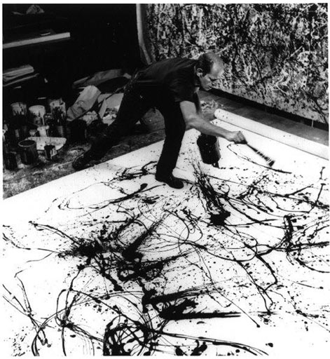
 Vik Muniz, Pollock (from Pictures of Chocolate)
During the Muniz lecture, I kept thinking about Richard Prince and the Pandora's box he opened when he presented other people's photographs as his own. Or his joke paintings in which the joke written on the canvas, becomes more pathetic as its content becomes depleted by endless readings. These works had a deep sadness to them, as if there was nothing left to do or say, but only repeat, repeat, repeat what is already known. Muniz also borrows from artists and photographers with abandon, but without any irony or particular feeling. Quoting great art makes his work seem "cultured' and it provides a great composition at no cost. But too often Muniz does not find the chemistry between material and image that transforms the both of them into a new work of art and as a result many of his works are only copies of the art of others made in unusual materials.
Roberto Juarez
I appreciate the thoughtful laying out of Mike’s annoyance with the Muniz lecture. I see the point about originality. But when I think about Muniz I’m thinking about photography and how it is used in ways that are different from painting and design. That’s where Andrea Serrano and his submerged crucifix in urine comes to mind. What we are looking at there is a photograph that triggers a response, which is what Muniz also does in a different way. His renderings of existing art in different media create responses that can be sensual, funny and also tender, all things I look for in art, even photos.
Also Muniz is from Brazil .where survival and joy of life live in the same house, and that sensibility comes through.
There’s a state, when you’re making a painting where you capture a certain liveliness of color and form, yet when you try to take a picture of it, you find it doesn’t translate to photography. You can’t get it. Muniz is able to capture those moments in a way that’s sensual and immediate, that photography doesn’t usually do—not well, anyway.
He has come upon a design-y way to make that media sing and laugh again. Yes, it is gimmicky, but it works. I look at his picture of Freud in chocolate and it’s ridiculous on the one hand, but it sucks me in in a way that goes deeper than just how it’s made. I think his Divas were trashy but that's what I want in a diva. (By the way I think the source for those pictures, were the credits for one of my favorite films as a child in Chicago, "Imitation of Life." )
 Vik Muniz
I saw one of those diamond diva pictures the day before, at the Phillips de Pury auction house, and it was spectacular. First of all it was big and beautiful and the detail wasn’t tasteful like Andy, but glitzy and tawdry, more like a drag queen. Also Muniz was very strategic about the number of prints he made (three). So in one way he’s saying that photography isn’t precious, but then he makes it precious again, like knocking something off the pedestal and then putting it right back on.
Carol Diehl:
While I appreciate what Roberto is saying, I have to agree with Mike on the point of originality. During the lecture I was totally captivated, but once I left—unlike a great concert where you keep replaying it in your mind with pleasure—the memory of it felt empty. Muniz is delightful and intelligent, his ideas are clever and the pictures are beautiful—but is it our goal to have clever ideas and make pretty pictures? Or is it to present something that provokes a deep emotional response?
What is it we’re always telling our writing students? “Show, don’t tell.” Well it’s true for visual art as well. The best art suggests rather than tells, creates mystery, doesn’t give away the entire story but provides places for our minds to wander in new ways. A truly great work of art bears repeated viewings; every time we look at it we find more to see, experience it differently. When we’re confronted with art-about-art such as Muniz’s, because it’s a treatment of an image we already know, we swallow it whole. There’s no tension because the end of the story was given away in the first paragraph.
I’m an advocate for original imagery not because of any particular art world snobbism or belief in its preciousness, but because the quest for an image that speaks for an artist is supremely difficult and challenging, and that struggle with success and failure ultimately becomes evident in the work, making for a deeper, more satisfying experience for the viewer.
 Vik Muniz, Pictures of Color
 Gerhard Richter: Betty. 1988. Oil on canvas, 101.9 x 59.4 cm. The Saint. Louis Art Museum. Copyright Gerhard Richter. Photo courtesy Saint. Louis Art Museum.
This may seem incongruous coming from an artist who uses found imagery in her own paintings, and who has professed her admiration for Shepard Fairey and Olafur Eliasson: one who takes a certain pride in his lack of technical ability, who samples the work of others to create his images, and the other who works with a team on his ideas. Yet to me this is not at all contradictory—these are simply methods, different avenues taken to arrive at unique statements that engage on a wordless emotional level.


8 comments:
enjoyed the three viewpoints about Vik Muniz...I never cared about the work....not enough substance to keep my attention....agree with Carol about wanting to experience a work that you feel like revisiting...I'm a little bored with recent work that wears its "cleverness" on its sleeve....haven't we had enough of that?....give me more shows like the Picasso's "Mosqueteros" at Gagosian this past spring...I returned to that one about five times....R.M. Fischer
Whether I agree with the viewpoints, or not, depends on the moment -- perhaps I am too fickle.
On second thought, I have realized that the comments were so thought provoking -- I actually found them more engaging than the art (though clever and beautiful). Perhaps I am not so fickle.
I feel the same way about Muniz as I feel about Greenaway films - commercials aspiring to be art - only looking arty for it.
Yeah Vic has the patter down, but it's really the kind of slender idea usually called a gimmick.
Earlier this year I was at a conference where Ad-Illustrator maestro Stefan Sagmeister held forth to similar acclaim. Stef too assembles tableau for text and photographs it to the thrill of corporates.
Unfortunately, Vic is a lot closer to Sagmeister than to some more pointed critique.
Trying again, this type with better spelling:
Leaving the work aside for the moment, I'd like to commend Carol for posting these viewpoints on her blog. Reading the comments of three artists who have the ability to write critically reminds us how narrow the single opinion is--not invalid, but limited by the viewpoint of one person. I'm not sure that "dimensional" criticism is possible in most publishing situations, but it's a great idea.
Carol, I do believe you have created an idea the needs to be continued in the blogosphere.
Love the idea of being presented with 3 points of view about an artist, lecture, show...by artists...even better. I will comment further after I've reread the 3 pieces.
thanks Carol...
I really like the idea behind this post!
As for Vik Muniz,
Hey Faris! - I'm a bit of a fan.
Post a Comment